Wednesday, 20 March 2013

Logo


I struggled when choosing my magazine title font as nothing was exactly what I was looking for. I knew I didn't want it to look plain and that I wanted it to be the thing that stood out most on the front cover. I began to search for different more interesting fonts. In the end I decided instead of making the whole title an interesting font; I was just going to do something different with the E. Popular music magazine Q uses this technique, making the Q a remembered logo. The logo currently used on my magazine is circular and interesting. I have chosen this one as it stood out for me whilst browsing www.dafont.com.

Barcode

Today I made my barcode using the Photoshop software. I chose to make and add a barcode as it is a convention of music magazines.

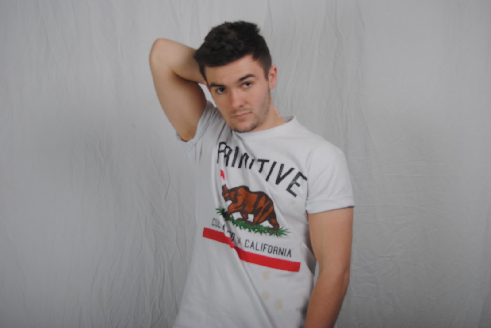
Front Cover and Double Page spread photos


 These are my initial rough photos for my contents page and double page spread. I decided to use a male model for these as I am having a female on the front because that is what I learnt from my research. Some of these photos I will have to re-take as they are quite unfocused. But overall they have turned out successful.


Sunday, 10 March 2013

Contents page initial thoughts

Through looking at different music magazine contents pages I have collected my ideas together so far and have came up with this contents page using a male model. By using a male model on my contents page it has solved my dilemma of what gender to make my model. However for the front cover I will instead use a female model as my questionnaire said the prefer a female model on the cover.

Analysis on Florence and the machine double page spread

Notes

Just a few notes I've been making about my magazine. Trying to gather my ideas together on paper in order to get further in designing my magazine. On this page I have drafted a few layout ideas for my contents page. I have also thought about my models - male or female? That is my current debate. Finally the scribblings on the right are ideas for a possible small iconic logo for the magazine. Hopefully soon I will have gone through all my ideas and can finally get round to applying them to the rough cut.