
Wednesday, 24 April 2013
Double page spread final cut
This is my final cut for my double page spread not as much has changed on my double page spread as my other pages however I still think I've made significant changes.
Tuesday, 23 April 2013
Contents page final cut
This is my final cut for my contents page, it almost looks a completely different page since my rough cut.

Monday, 22 April 2013
Front cover final cut
This is my final cut for my media studies music magazine. I have made many changes since my rough cut.

Sunday, 21 April 2013
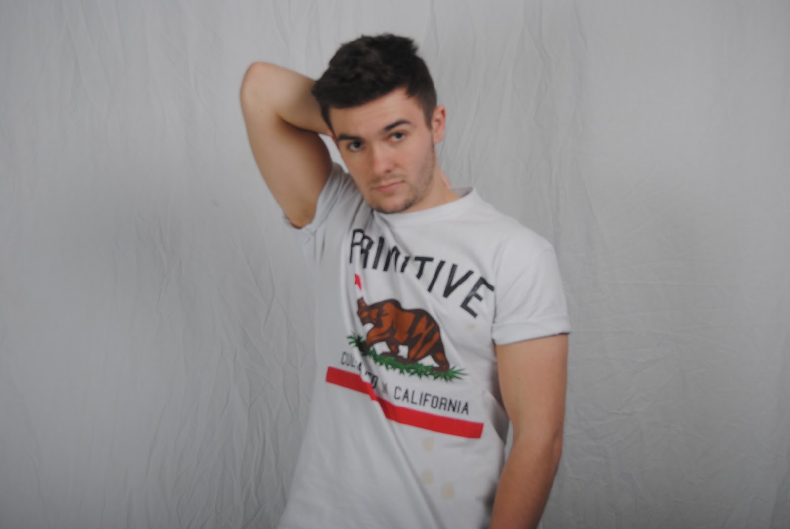
Front cover photo change
After receiving my rough cut improvements back I realised that my front cover photo wasn't as high quality focus as I'd want. I I decided to retake the photo making sure to have it as focused as possible. To add darken the photo I also edited my photo on photoshop adjusting the opacity and contrast.

Saturday, 20 April 2013
Extra photo
Today I took and added my forth photo to my double page spread. I chose to have my model perched on the lines that form his name. To do this I used a table in the media studio then through using photoshop I cut out the table so I had my model perfectly perched on top of the lines.

Friday, 19 April 2013
More photos
Today I took several new possible photos for my contents page and double page spread as the current photos weren't strong enough.

Thursday, 18 April 2013
Contents page changes
After handing in my rough cut it was decided that my contents page photo wasn't strong enough for an image dominant contents page so I had to change it. After looking at other image dominant contents pages I noticed that the more effective ones tend to have the model looking right into the lens. I followed this convention when taking my new photos. In the end I decided on this photo as it was clear, nicely proportioned and I thought it would incorporate well into the page.

Wednesday, 17 April 2013
4th picture
My magazine needed a forth picture, normally multiple photos are placed on a contents page, but because of the image dominant layout I have chosen I physically cannot fit another photo on without making the page look cluttered and disorganised. The second option I had was to incorporate another photo onto my double page spread. Because most of the page was taken up on my double page spread I decided to add a small photo to the top left corner. I experimented this by using an old photo from a previous photo shoot. Overall I like this touch and will experiment further with other photos.

Tuesday, 16 April 2013
Double page spread 4th photo
Changes made to my double page spread is the small picture added to the top left corner of the page. This is my final picture of the four required for my magazine. It needed to be small as I didn't have much space to add a photo anywhere else because of the image dominant approach I chose.

Monday, 15 April 2013
Final extra photo
In the end I chose this photo to add to my double page spread as it looked the most natural and fitted in the place perfectly. I cut around the picture and photoshop and corrected any imperfections.

Sunday, 14 April 2013
Extra photos
Today I took my photos for my extra double page spread photo. The idea was to have a mini photo of my model perched on the lines that write his name. To begin I have him standing on the line but it looked too forced and didn't fit in well. So I took more photos with different poses to see if they would fit better these are the results.

Saturday, 13 April 2013
Front cover changes
I have made a few changes to my front cover since my last post. Firstly I have added more story headlines to the right of the page as I thought it looked a bit bare without this text. I have changed the colour of the 'plus+' too gold instead of yellow as I thought the yellow stood out too much and made to much contrast. Not fitting with the rest of the magazine. Finally I have added the byline to the top of the page, I mimicked this convention from Q magazine.

Friday, 12 April 2013
Contents page changes
From my last post about my contents page I have cut around the photo better using photoshop and changed the features text. Instead of having brief lines per feature I have added a short sentence about the stories as it is conventional. Overall I am pleased with my contents page using vibe as a style model.

Thursday, 11 April 2013
Double page spread text edit
I felt my double page spread was looking bare in terms of text so I decided to add a headline and more content to the questions. I am overall now very happy with all the text and won't be reworking it anymore. I do however need to incorporate another photo onto the page.

Wednesday, 10 April 2013
Double page spread rough cut feedback
- Photo cut out better
- better sense of columns needed
- more content
- smaller font size
- image crossing centre fold less
Contents page rough cut feedback
- More consistent house colour
- Photo cut out better
- Stronger photo
- Features more justified
- More text required in boxes
Rough Cut Front cover feedback
- Clearer photo
- Change colour of 'Plus+'
- Rethink the font colour on the right (hard to see)
- More text
- Artist name 'Rosie' 'Rendles' should be less overlapping
Rough cut double page spread
This is my rough cut of my double page spread. I am most happy with my double page spread as it challenges stereotypical conventions of a music magazine. But doesn't look so unconventional that it doesn't work. Improvements I could make to this would be the text. As I have chosen a difficult layout it becomes difficult to organise text. Then also because my text is made up of different sections that cannot be mixed. It's a difficult challenge but if I can overcome it it will be effective. Overall I am pleased with my double page spread but still have a few alterations to make. I will post my feedback on my double page spread soon.

Tuesday, 9 April 2013
Rough cut contents page
Again I have reverted to the red house colour and changed it on my contents page as well. I am happy with the layout of my contents page in terms of photo and my initial plan, however I am still not satisfied with the text on the page. I may consider adding another small photo on the page and changing the text. I will also be posting my feedback on my contents page soon.

Monday, 8 April 2013
Rough cut front cover
I decided to revert back to my initial red colour for the house colour before handing in my rough cut. I also FINALLY decided on my front cover photo I am happy with the model, pose and positioning. However I may retake the photo making it more focused and change the outfit of my model. Overall I am happy with the standard of my rough cut and at this point am happy in the knowledge where I can improve. I will be posting shortly my audience feedback on what they think needs improving.

Sunday, 7 April 2013
Contents page changes
As I changed the house colour on my front cover I decided to test it on my contents page. I have also added numbers and a brief text to my contents page. Although I have chosen a more image dominant approach I think more text needs to be featured on my page and I'm still not 100% on the blue house colour. I shall conduct some market research to find out what my audience prefers.

Saturday, 6 April 2013
Front cover text change
Today I reviewed my front cover and thought more about the front cover photo and how I could incorporate it with my layout in a way it fitted perfectly. I realised that it was conventional to have a white background on the photo this makes all the text stand out but also the image: making the background stay unimportant. I decided to make my text stay standing out I had to change the colour of some of my text if it was going to have a white background. To present this I have used a contrasting colour - red.

Friday, 5 April 2013
Double page spread with article
After writing my article I have applied it to my double page spread. Already after adding my article it looks a lot more professional and complete.

Video Focus Group
- A better contrast was created with the red
- The red complimented her complexion
- Red was the preferred colour in general
- Red caught there eye more
- Red wasn't gender specific
Both colour schemes however proved difficult to read as the colours didn't contrast enough with the model.
my final decision was that red was the more preferred colour and that my house colour would be red. I am happy with this result and agree with my target audience that it looks better.
Thursday, 4 April 2013
Front cover colour change
After placing everything on my page and being happy with the layout I changed my attention to tweaking the colour scheme and certain features making it look more conventional and professional. I have experimented with blue instead of red. I like the blue but feel it looks like more of school magazine I will conduct some research into what my target market prefer in a few posts time. I have also changed my "free posters" bubble. I have decided to make it gold as it looks more classy and will not clash with any colour I decide on.

Wednesday, 3 April 2013
Front cover logo position
I decided I wanted a logo; the logo fit perfectly in the top right corner of my pages. However I am finding it a lot more difficult to place it on my front cover. I previously placed it on the corner of my page but now I have moved it to the top of my page. Incorporating it into the title by replacing the E with the logo.

Tuesday, 2 April 2013
Contents page changes
Not much has changed in terms of my contents page I am still to add stories to it however I have been focusing on my other pages so need to make more improvements on this. Just thought I'd keep you updated though! I haven't forgotten.

Monday, 1 April 2013
Front cover changes
As you can see ALOT has been changed on my front cover since my last post. Like I said in my previous post everything is being made red for visibility purposes it I not a final decision - although red is a contender for my house colour as it is conventional. I have changed the font to something a lot more suitable and conventional, the previous font wasn't in check with what my magazine is. I have chosen a more serif font. However I am still not entirely pleased with this voice either so I will continue to search for a better font. An extra side story has also been featured on the page.

Sunday, 31 March 2013
Double page spread changes
Because I am not yet sure on my house colour I am putting everything in one colour then after I have placed and created everything I shall think more about my colour scheme. For now though I will go with my initial idea and make it red. This is my double page spread with finalised font. I have extended the lines going off the page because I felt that with the lines just suddenly ending it looked randomly placed rather then a thought over placement like it is.

Saturday, 30 March 2013
First draft of front cover
This is my first draft of my front cover on inDesign. So far out of my work I am least happy with my front cover. It may be because it still lacks a cover photo. But I'm not pleased with some of the fonts (especially the title) and the sizing of some of the factors. I will be changing this through looking at my research and trying out different fonts. I will also take and edit my photo soon.

Friday, 29 March 2013
Double page spread first draft
This is my first draft on inDesign for my double page spread. This is my chosen font &&@&£@&. I chose this one as it instantly caught my eye and I found it interesting. I was able to imagine it on my page and could see how I could incorporate it.
Thursday, 28 March 2013
JayZ double page spread Q analysis

Title font
Today I went though numerous fonts on the Internet using the website dafont. I have decided I want a large bold serif font for my title as it has to stand out on the page and fill the required space I have designed for it. I have not yet chose a font but after looking through this website I know what I want it's just a matter of finding it.


Wednesday, 27 March 2013
Mark Ronson NME double page spread analysis

First draft of contents page
This is my first draft of my content page on inDesign. I have not yet added any house colour theme to my contents page. My photo fits well with my page design but as I add colour i may need to rethink a few factors of the layout.

Tuesday, 26 March 2013
Client Profile
In order to make my article I decided to make a client profile of my artist.
Name: Jesse Sanson
Age: january 9th 1991
Born: Glasgow moved to london to persue his passion for music
Album: Suburbia
Released 18th March 2013
Tour name: Suburbia tour
Spread over a year around Europe and Central America
One smaller tour before just around the UK then it took off, The Vines tour
Singer songwriter
Beginning: YouTube busking and record company found snapped up Hologram records
Article
This is my article for my double page spread. It is a mix of a brief summary of the artist and a fan question answer section.
YouTube seems to be the hottest place for
record labels to find global superstars. With national sensations like Justin
Beiber and Lana Del Rey popping up from nowhere and suddenly making it huge, it
was only a matter of time before Hologram Records snapped up the comforting
sound of Jesse Sanson. Jesse, originally from Glasgow Scotland moved down to
London as an adolescent at the age of 17 to pursue his dream of becoming a
successful singer-song writer. ‘Suburbia’ is Jesse’s recently released album
(18th March 2013) already it has made it straight to the top of the
album charts. The albums success points to him achieving a very promising tour beginning
at the end of this year.
“This tour is going to be SO much more
advanced then my last, I have so many exciting surprises in store for my fans!”
If you didn’t catch Jesse on his last tour ‘The Vines” I suggest you keep an eye out for a venue
near you as these tickets will go faster then you can say your name.
-something about breaking america-
WHO DO YOU COMPARE YOURSELF TOO?
SARAH ROBINSON
Ed Sheeran. Our music flows within similar roots, we both have our own originality which compliments our music. Would you say your better? [Laughs] theres potential for me to exceed what he has achieved.
WHAT WAS THE FIRST SONG YOU FELL INLOVE WITH?
ALEX WRIGHT
Justin Timberlake of course - I have always been a fan of his music. However my favourite song would have to be... “What goes around, comes around.”
WHAT’S YOUR FAVOURITE FILM?
CHLOE RISEBOROUGH
The social network. Its a very intelligent film, featuring Justin Timberlake [laughs]. If anyone hasn’t seen it I’d suggest you watch it.
WHAT HAPPENS AFTER THE TOUR?
LIZZY JAMES
I’ll take some time off, as much as I love music the lifestyle can be tiring. However this doesn’t mean I’ll forget music, any inspiration at all and I will begin writing again.
WHEN DID YOU REALISE YOU'D MADE IT ASH RANADE
Headlining a few major festivals alongside my own ad commercial.
Friday, 22 March 2013
Holiday
I have recently came back from a holiday in Barcelona. Whilst in Barcelona I decided I was going to make final decisions on my model names. Whilst there I thought about the names of the people I'd met. In the end I decided on the name "Jesse Sanson" for the male and "Rosie Rendles" for the female.
Gold bubble
Today on photoshop I created a good bubble to advertise free posters on my magazine. I originally wanted to make it yellow to alert the reader to it. However I then seen a bubble on Q magazine which was gold. I liked the gold a lot more as it looked more classy; it also would not clash with any colour scheme I chose.

Double page spread first draft
This is my first official draft of my double page spread I have gone through many different layouts and poses. This is my final draft and I will begin making it in photoshop soon.

Thursday, 21 March 2013
Lana Del Rey NME double page spread analysis

Wednesday, 20 March 2013
Logo
Barcode

Front Cover and Double Page spread photos


Subscribe to:
Comments (Atom)