
Sunday, 31 March 2013
Double page spread changes
Because I am not yet sure on my house colour I am putting everything in one colour then after I have placed and created everything I shall think more about my colour scheme. For now though I will go with my initial idea and make it red. This is my double page spread with finalised font. I have extended the lines going off the page because I felt that with the lines just suddenly ending it looked randomly placed rather then a thought over placement like it is.
Saturday, 30 March 2013
First draft of front cover
This is my first draft of my front cover on inDesign. So far out of my work I am least happy with my front cover. It may be because it still lacks a cover photo. But I'm not pleased with some of the fonts (especially the title) and the sizing of some of the factors. I will be changing this through looking at my research and trying out different fonts. I will also take and edit my photo soon.

Friday, 29 March 2013
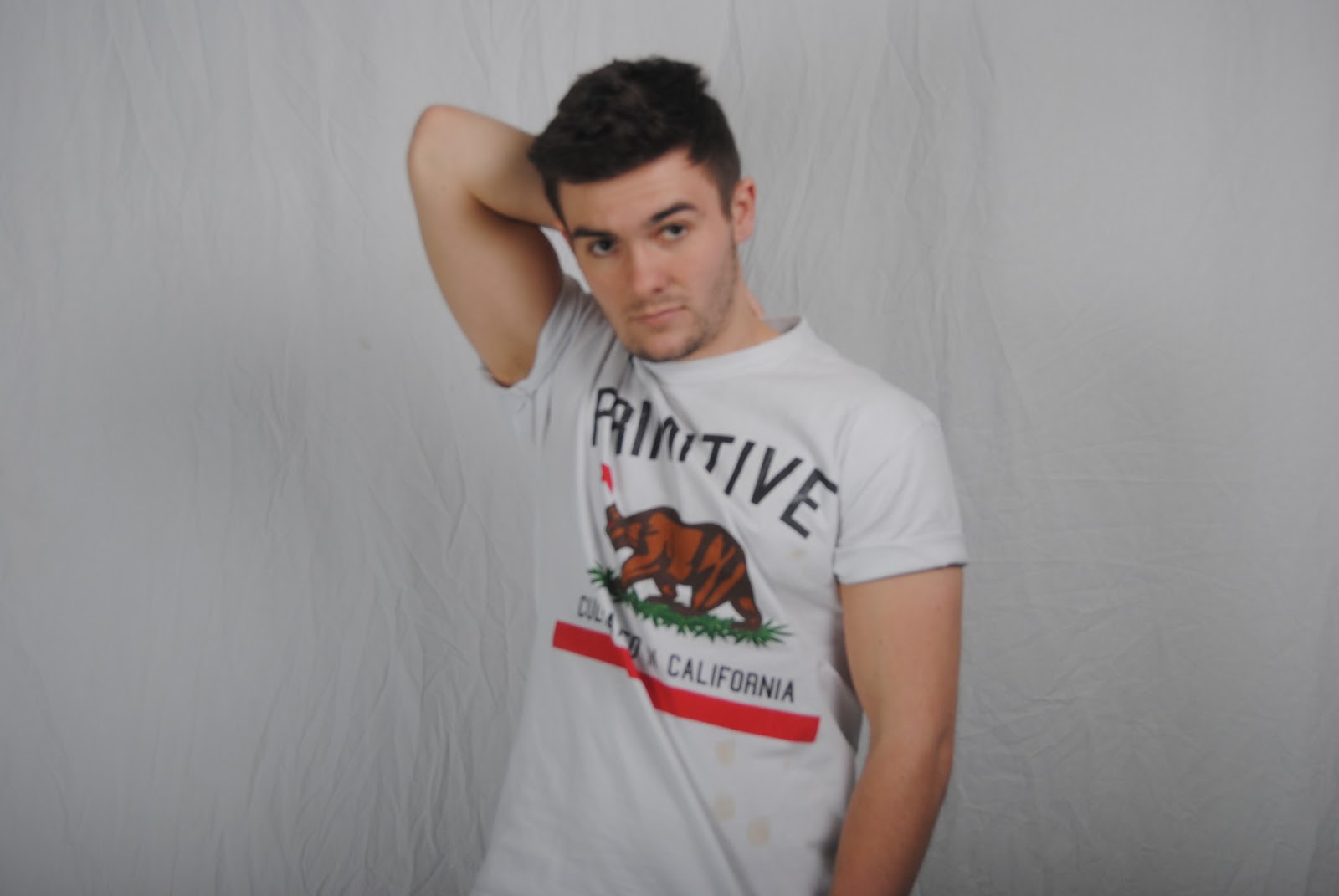
Double page spread first draft
This is my first draft on inDesign for my double page spread. This is my chosen font &&@&£@&. I chose this one as it instantly caught my eye and I found it interesting. I was able to imagine it on my page and could see how I could incorporate it.
Thursday, 28 March 2013
JayZ double page spread Q analysis

Title font
Today I went though numerous fonts on the Internet using the website dafont. I have decided I want a large bold serif font for my title as it has to stand out on the page and fill the required space I have designed for it. I have not yet chose a font but after looking through this website I know what I want it's just a matter of finding it.


Wednesday, 27 March 2013
Mark Ronson NME double page spread analysis

First draft of contents page
This is my first draft of my content page on inDesign. I have not yet added any house colour theme to my contents page. My photo fits well with my page design but as I add colour i may need to rethink a few factors of the layout.

Tuesday, 26 March 2013
Client Profile
In order to make my article I decided to make a client profile of my artist.
Name: Jesse Sanson
Age: january 9th 1991
Born: Glasgow moved to london to persue his passion for music
Album: Suburbia
Released 18th March 2013
Tour name: Suburbia tour
Spread over a year around Europe and Central America
One smaller tour before just around the UK then it took off, The Vines tour
Singer songwriter
Beginning: YouTube busking and record company found snapped up Hologram records
Article
This is my article for my double page spread. It is a mix of a brief summary of the artist and a fan question answer section.
YouTube seems to be the hottest place for
record labels to find global superstars. With national sensations like Justin
Beiber and Lana Del Rey popping up from nowhere and suddenly making it huge, it
was only a matter of time before Hologram Records snapped up the comforting
sound of Jesse Sanson. Jesse, originally from Glasgow Scotland moved down to
London as an adolescent at the age of 17 to pursue his dream of becoming a
successful singer-song writer. ‘Suburbia’ is Jesse’s recently released album
(18th March 2013) already it has made it straight to the top of the
album charts. The albums success points to him achieving a very promising tour beginning
at the end of this year.
“This tour is going to be SO much more
advanced then my last, I have so many exciting surprises in store for my fans!”
If you didn’t catch Jesse on his last tour ‘The Vines” I suggest you keep an eye out for a venue
near you as these tickets will go faster then you can say your name.
-something about breaking america-
WHO DO YOU COMPARE YOURSELF TOO?
SARAH ROBINSON
Ed Sheeran. Our music flows within similar roots, we both have our own originality which compliments our music. Would you say your better? [Laughs] theres potential for me to exceed what he has achieved.
WHAT WAS THE FIRST SONG YOU FELL INLOVE WITH?
ALEX WRIGHT
Justin Timberlake of course - I have always been a fan of his music. However my favourite song would have to be... “What goes around, comes around.”
WHAT’S YOUR FAVOURITE FILM?
CHLOE RISEBOROUGH
The social network. Its a very intelligent film, featuring Justin Timberlake [laughs]. If anyone hasn’t seen it I’d suggest you watch it.
WHAT HAPPENS AFTER THE TOUR?
LIZZY JAMES
I’ll take some time off, as much as I love music the lifestyle can be tiring. However this doesn’t mean I’ll forget music, any inspiration at all and I will begin writing again.
WHEN DID YOU REALISE YOU'D MADE IT ASH RANADE
Headlining a few major festivals alongside my own ad commercial.
Friday, 22 March 2013
Holiday
I have recently came back from a holiday in Barcelona. Whilst in Barcelona I decided I was going to make final decisions on my model names. Whilst there I thought about the names of the people I'd met. In the end I decided on the name "Jesse Sanson" for the male and "Rosie Rendles" for the female.
Gold bubble
Today on photoshop I created a good bubble to advertise free posters on my magazine. I originally wanted to make it yellow to alert the reader to it. However I then seen a bubble on Q magazine which was gold. I liked the gold a lot more as it looked more classy; it also would not clash with any colour scheme I chose.

Double page spread first draft
This is my first official draft of my double page spread I have gone through many different layouts and poses. This is my final draft and I will begin making it in photoshop soon.

Thursday, 21 March 2013
Lana Del Rey NME double page spread analysis

Wednesday, 20 March 2013
Logo
Barcode

Front Cover and Double Page spread photos


Monday, 11 March 2013


Sunday, 10 March 2013
Contents page initial thoughts
Through looking at different music magazine contents pages I have collected my ideas together so far and have came up with this contents page using a male model. By using a male model on my contents page it has solved my dilemma of what gender to make my model. However for the front cover I will instead use a female model as my questionnaire said the prefer a female model on the cover.


Notes
Just a few notes I've been making about my magazine. Trying to gather my ideas together on paper in order to get further in designing my magazine. On this page I have drafted a few layout ideas for my contents page. I have also thought about my models - male or female? That is my current debate. Finally the scribblings on the right are ideas for a possible small iconic logo for the magazine. Hopefully soon I will have gone through all my ideas and can finally get round to applying them to the rough cut.

Saturday, 9 March 2013
Collecting research
I have conducted a survey to find out what my target audience would like the see regarding my front cover. I am currently creating a tally chart then will present my findings on graphs.

Tuesday, 5 March 2013
Questionnaire on front cover
Focus group
Music magazine Questionnaire
Front cover
1) Which name do you prefer out of the line up?
a.
Impulse
b.
Amour
c.
Pearl
d.
Elixir
e.
Lilt
2) What do you think the house colour scheme should be?
a.
Reds
b.
Blues
c.
Purples
d.
Greens
3) Should the font be flicky or not?
a.
Yes
b.
No
4) Should the model be male or female?
a.
Male
b.
Female
5) Should the model be the most dominant thing on the page?
a.
Dominant
b.
Not dominant
6) Out of these layouts which do you find the most pleasing
to the eye?
Possible Magazine names
In todays lesson I thought of possible magazine names so far names I've liked are:
In the next few weeks I will be conducting some research in a focus group within my target audience to see which would prove most effective. In this research I will also be solving other critical decisions with my focus group and recording my findings; applying them to my magazine.
- Elite
- Impulse
- Elixir
- Amour
- Lilt
In the next few weeks I will be conducting some research in a focus group within my target audience to see which would prove most effective. In this research I will also be solving other critical decisions with my focus group and recording my findings; applying them to my magazine.
Monday, 4 March 2013

Q issue 307 contents page analysis
 This is quite a clear and concise contents page used by Q.
It is simple but effective; its simplicity makes it look classier and doesn't need
to be crammed and busy looking.
This is quite a clear and concise contents page used by Q.
It is simple but effective; its simplicity makes it look classier and doesn't need
to be crammed and busy looking.
I think I prefer this simple minimalistic approach; it is
very keeping with the vibe of Q magazine. Q after all standing for ‘Quality’. I
am going to make my contents page similar to this one as I think it is more
effective than a more busy looking contents page. The purpose of a contents
page is to inform – and this one is easy to read, thus serving its purpose.
The layout of the
page is important it can either be blocky or more image dominant. However this
contents page seems to follow both. Majority of the page is taken up by one
dominating picture of Lana Del Rey (also the front cover star). But at the same
time the general effect of the page is organised with a blocky layout. It is
also left justified all of the text on the left side of the page and all of the
images on the right.
At first I wanted to create a contents page more like the
50cent one where it was more image dominated and had barely any writing. But
after seeing this contents page I may have changed my mind as I really like the
simplicity of it.
A house colour is used throughout Q magazine, this is the
red. Q is known of its red Q logo, connotations of the colour red are passion
and lust. This makes it look like something the reader desires.
For my magazine I may use a house colour. However because Q
is so well known for being red I wouldn’t want to use this colour as my
magazine would look to be a copy of Q – this is bad for my magazine as it would
always be in the shadow of Q. Instead I am going to conduct some research into
finding out what colours my target audience like.
Finally it is important to pick up on small details on the
page, details like the page number and the small arrows pointing off the page. These
minor details are easily overlooked nut without them the page wouldn’t be the
same. Also the numbers are all of different sizes – this would have been very thought-out.
It would be imminently noticeable if something was out of shape.
I will be taking good care when adding these details to my
work as they are an important feature that adds up to making my magazine look
more professional.
Subscribe to:
Comments (Atom)