Friday, 22 March 2013

Holiday

I have recently came back from a holiday in Barcelona. Whilst in Barcelona I decided I was going to make final decisions on my model names. Whilst there I thought about the names of the people I'd met. In the end I decided on the name "Jesse Sanson" for the male and "Rosie Rendles" for the female.

Gold bubble

Today on photoshop I created a good bubble to advertise free posters on my magazine. I originally wanted to make it yellow to alert the reader to it. However I then seen a bubble on Q magazine which was gold. I liked the gold a lot more as it looked more classy; it also would not clash with any colour scheme I chose.

Double page spread first draft

This is my first official draft of my double page spread I have gone through many different layouts and poses. This is my final draft and I will begin making it in photoshop soon.

Thursday, 21 March 2013

Lana Del Rey NME double page spread analysis

This NME double page spread goes against regular convention by applying a black and white photo and creating a high contrast difference on the article page by using opposite colours blue and orange. The photographer has chosen to use a black and white photo because of the artist, Lana Del Rey's music is mainly sad slow songs. The black and white effect presents this as she is not vibrant and 'pop' she is 'traditional.' I am going to relate my photograph choice to my artist and article when I make my double page spread as I think it proves a more effective collective page as everything ties in for a purpose. The choice to add the small facts table in the middle of the chart is relevant to the article 'Mission accomplished. As it is showing how much she has accomplished. In my double page spread I am going to add either a chart or quote to my relating to my article.

Wednesday, 20 March 2013

Logo


I struggled when choosing my magazine title font as nothing was exactly what I was looking for. I knew I didn't want it to look plain and that I wanted it to be the thing that stood out most on the front cover. I began to search for different more interesting fonts. In the end I decided instead of making the whole title an interesting font; I was just going to do something different with the E. Popular music magazine Q uses this technique, making the Q a remembered logo. The logo currently used on my magazine is circular and interesting. I have chosen this one as it stood out for me whilst browsing www.dafont.com.

Barcode

Today I made my barcode using the Photoshop software. I chose to make and add a barcode as it is a convention of music magazines.

Front Cover and Double Page spread photos


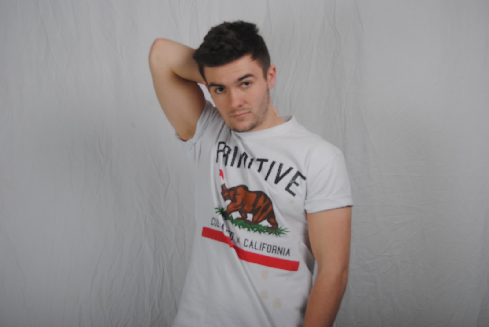
 These are my initial rough photos for my contents page and double page spread. I decided to use a male model for these as I am having a female on the front because that is what I learnt from my research. Some of these photos I will have to re-take as they are quite unfocused. But overall they have turned out successful.